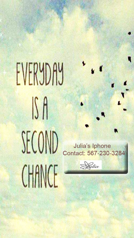
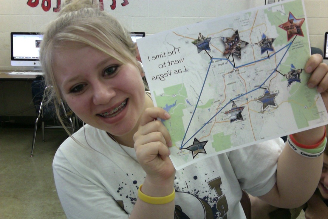
This was a wallpaper we made in class for our phones. We picked a background and then put our logo and contact information on it to make it look more realistic we added the rectangle to blend in. This project was cool because now I have a new wallpaper.
This was an assignment we did so we would have something moving out of our layers. I went through and erased a part of me as I took my hand across my face. I really liked this project because it showed me how to make an object look like it was chafing or moving. I still have some work to do but for the most part this was very beneficial. This project we were practicing new neat tricks to do in photoshop. If you look closely I took new tools to make a shadow of the angel to make her look more realistic. Also I had to mess around with the hue and saturation to get the background to look dark and mysterious. This was practice when we first began Illustrator. I had struggled but began to get the hang of the pen tool which really helped me. This was another project in illustrator helping us learn how to blend colors and also create the shapes and copy them. Illustrator helped me a lot mainly because it was so difficult. This was a map also made in illustrator. It shows a map of a place you have been. I really liked this project, but when trying to go back into it I did not save my pictures and I had to take a picture of the printed copy I had made. The time I went to Las vegas. This project was made to layout sins which prepared us for future projects. I still committed some of the sins, so this definitely helped me in the end. I made a second copy of laying out my sins. I seem to struggle with centering things, which is a weakness, but this project helped me to begin to get over doing that. It taught me how to improve. This was my favorite project. At first all I had was the idea of me screaming and when putting certain effects into the poster it portrayed a figure in the background which I then turned into someone coming behind me. I put the most work into this project and it came out really well and reminds me of an actual movie poster. We did this in InDesign. I showed a two page spread about polar bears. It showed me how to make an article which will be beneficial. It also showed me how to warp the text around photos. |